Staysure Quote Journey
Overview
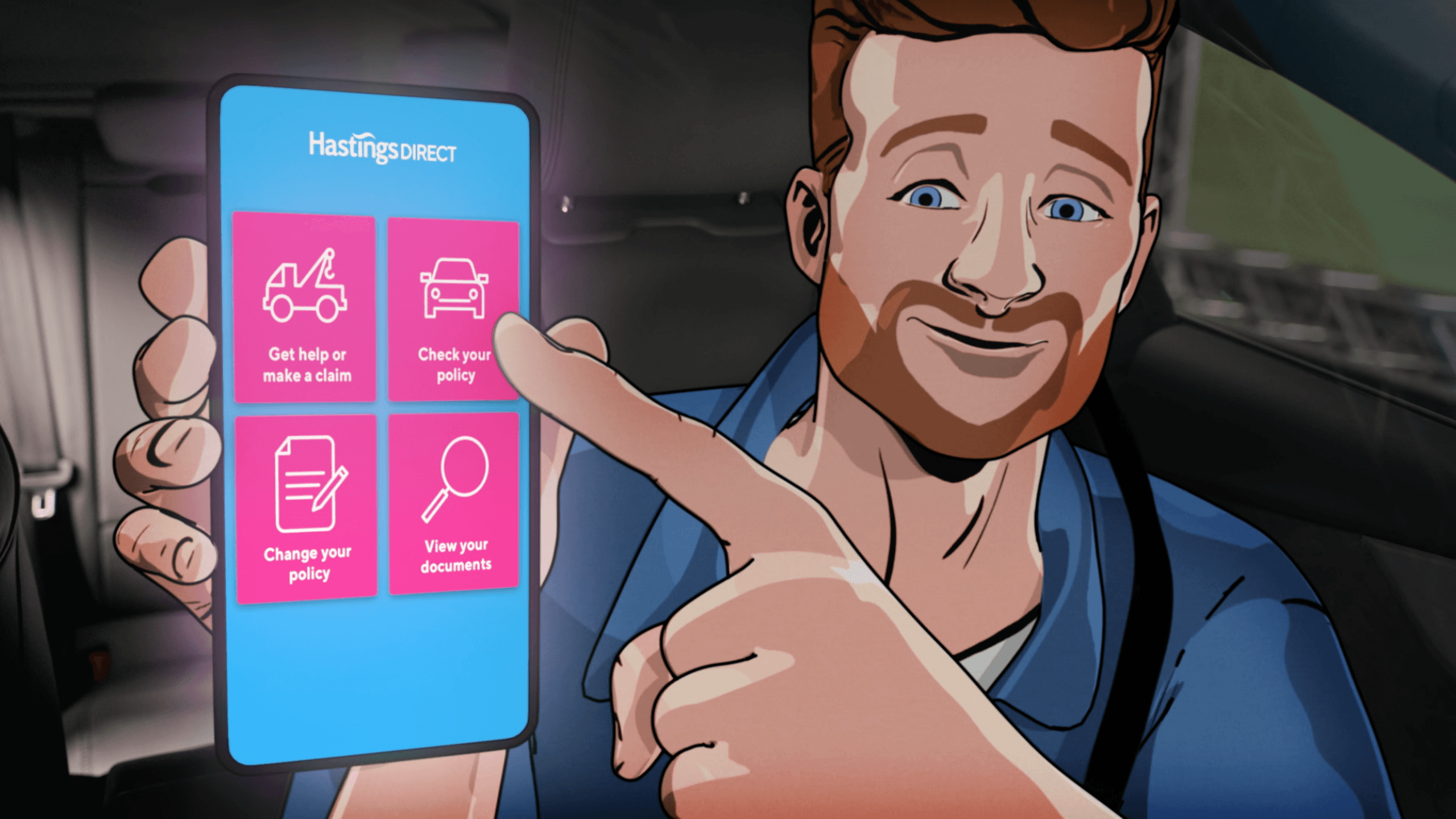
Staysure’s online travel insurance quote journey had fallen behind the times. The interface was dated, cluttered and built around internal logic rather than customer thinking. It wasn’t mobile-first, it wasn’t modular, and it didn’t reflect the evolving Staysure brand.
At the same time, the business was undergoing a wider digital transformation. We were redefining our tone of voice, modernising our positioning around “travel-sure”, and elevating brand consistency across channels. But the most commercially critical part of the experience (the quote-to-sale funnel) didn’t match that ambition.
Journey mapping and analytics revealed clear friction points:
Long, intimidating question sets
Confusion around cover types
High anxiety during medical screening
Poor mobile ergonomics
Language that felt formal and insurer-led
Drop-off wasn’t primarily about price. It was about uncertainty.
Customers were asking themselves:
“Am I covered properly?”
“What happens if I get this wrong?”
“Why are you asking me this?”
We needed to redesign the experience around clarity, reassurance and momentum — without compromising regulatory integrity or accessibility.
This was not a cosmetic refresh. It was a structural rethink of how Staysure sells insurance digitally.
Categories
UX/UI
Design Systems
User Research
Client
Staysure
Date
2023
Old quote journey & new treatment

The quote journey price page
Our Figma atomic design system
Process
We tackled the redesign through a collaborative, research-driven approach. Myself and the Head of Design led the creative direction, and tackled UX design alongside Product Owners and Director of Digital & Experience. We partnered with Wunderman Thompson to ground our work in real customer insights. The project began with in-depth research: Wunderman Thompson conducted user interviews, analysed analytics, and mapped out where people were dropping off or getting confused in the old journey. Hearing travellers describe the old process was eye-opening – lengthy forms, insurance jargon, and a non-responsive interface were clearly discouraging them. These findings gave us a roadmap of what to fix.
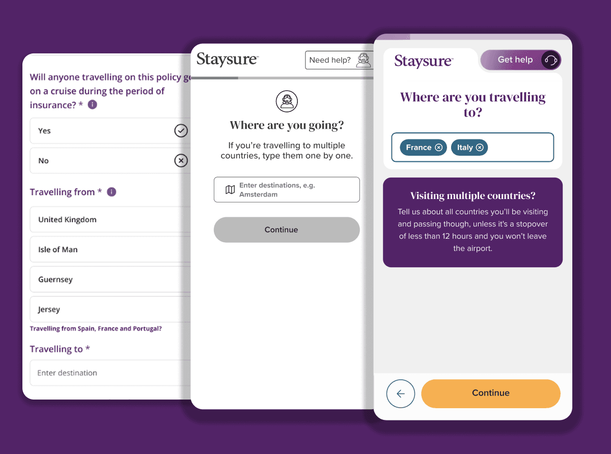
We broke the journey into clearer, shorter steps with visible progression. Instead of overwhelming users with a long one-size-fits-all form, we introduced progressive disclosure — surfacing complexity only when relevant.
The redesign shifted from cluttered, multi-input screens to focused, single-task interactions. Mobile wasn’t treated as a breakpoint adaptation; it was the starting point.
We prioritised:
Large tap targets
Clear hierarchy
Intentional whitespace
Strong, singular primary CTAs
The result was a journey that felt guided rather than interrogative.
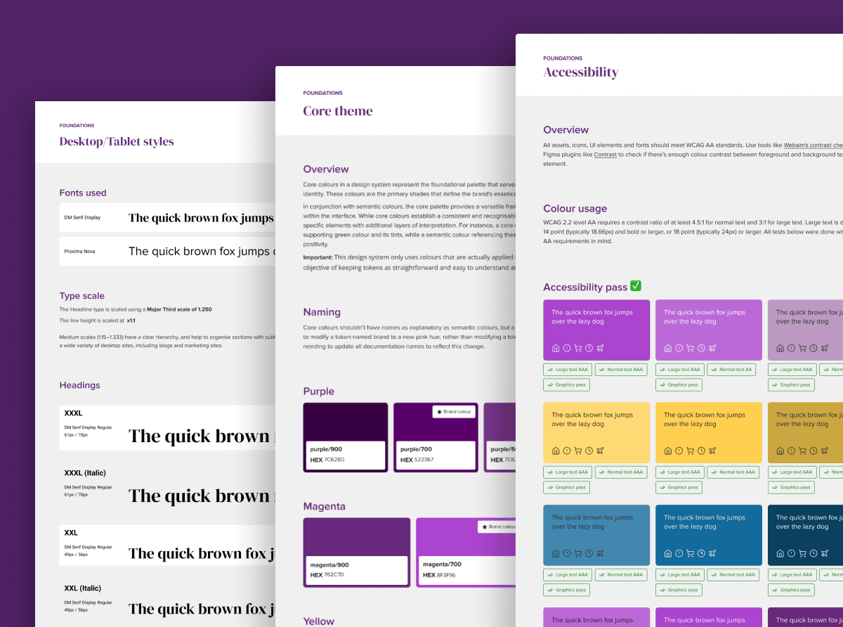
Myself and a mid-weight designer built out an atomic design system from scratch. It was built in a way that would allow us to easily reskin and repurpose for our other brands' quote journeys. The design system was built mobile first, with an emphasis on accessibility. I built and tested templated prototypes across mobile, tablet and desktop, stress-testing to make sure our design system assets were fit for purpose.
We built an interactive prototype and iteratively tested it with actual users (recruited by our research partners) to gather feedback early and often. Their feedback helped us fine-tune everything from the flow of medical screening questions to the wording of error messages. Once the design was validated, I worked with developers to bring it to life, making sure the polished UX carried through to the final product. We rolled out the new quote-and-buy journey and closely monitored its performance. The result was a responsive, user-centric experience that fit neatly into Staysure’s broader digital transformation efforts.
Takeaways
The redesign delivered real, measurable improvements for both customers and the business. Almost immediately, we saw more people completing their quotes and purchasing policies. Some key results included:
Higher conversion: A 5% increase in start-to-quote-to-sale conversion, meaning more travellers made it from “Get a Quote” to hitting “Buy Now.”
Boost in renewals: A 10% rise in auto-renewal rates, as the clearer journey and improved trust nudged more customers to let their policies renew automatically.
Larger basket size: A 2% increase in average order value, driven largely by mobile users – the new mobile-friendly design made it easier for customers to add optional upgrades and choose higher-tier cover on the go.
This uplift in the purchase journey contributed to broader growth for Staysure. In 2023, we had a record-breaking year. And again in 2024. While many factors drove that success, our improved online journey was a key piece of the puzzle, removing friction for thousands of customers. The momentum continued into 2024 with even stronger customer retention and higher-value sales.
This project reinforced a belief I hold strongly:
Most conversion problems are clarity problems.
When customers drop off, it’s rarely because they don’t want the product. It’s because something in the experience introduces doubt, confusion or cognitive overload. By anchoring decisions in research, designing around moments of uncertainty, embedding tone of voice into UX, and building scalable infrastructure rather than isolated screens, we transformed a legacy funnel into a modern, accessible, high-performing journey.
Staysure Quote Journey
Overview
Staysure’s online travel insurance quote journey had fallen behind the times. The interface was dated, cluttered and built around internal logic rather than customer thinking. It wasn’t mobile-first, it wasn’t modular, and it didn’t reflect the evolving Staysure brand.
At the same time, the business was undergoing a wider digital transformation. We were redefining our tone of voice, modernising our positioning around “travel-sure”, and elevating brand consistency across channels. But the most commercially critical part of the experience (the quote-to-sale funnel) didn’t match that ambition.
Journey mapping and analytics revealed clear friction points:
Long, intimidating question sets
Confusion around cover types
High anxiety during medical screening
Poor mobile ergonomics
Language that felt formal and insurer-led
Drop-off wasn’t primarily about price. It was about uncertainty.
Customers were asking themselves:
“Am I covered properly?”
“What happens if I get this wrong?”
“Why are you asking me this?”
We needed to redesign the experience around clarity, reassurance and momentum — without compromising regulatory integrity or accessibility.
This was not a cosmetic refresh. It was a structural rethink of how Staysure sells insurance digitally.
Categories
UX/UI
Design Systems
User Research
Client
Staysure
Date
2023
Old quote journey & new treatment
The quote journey price page
Our Figma atomic design system
Process
We tackled the redesign through a collaborative, research-driven approach. Myself and the Head of Design led the creative direction, and tackled UX design alongside Product Owners and Director of Digital & Experience. We partnered with Wunderman Thompson to ground our work in real customer insights. The project began with in-depth research: Wunderman Thompson conducted user interviews, analysed analytics, and mapped out where people were dropping off or getting confused in the old journey. Hearing travellers describe the old process was eye-opening – lengthy forms, insurance jargon, and a non-responsive interface were clearly discouraging them. These findings gave us a roadmap of what to fix.
We broke the journey into clearer, shorter steps with visible progression. Instead of overwhelming users with a long one-size-fits-all form, we introduced progressive disclosure — surfacing complexity only when relevant.
The redesign shifted from cluttered, multi-input screens to focused, single-task interactions. Mobile wasn’t treated as a breakpoint adaptation; it was the starting point.
We prioritised:
Large tap targets
Clear hierarchy
Intentional whitespace
Strong, singular primary CTAs
The result was a journey that felt guided rather than interrogative.
Myself and a mid-weight designer built out an atomic design system from scratch. It was built in a way that would allow us to easily reskin and repurpose for our other brands' quote journeys. The design system was built mobile first, with an emphasis on accessibility. I built and tested templated prototypes across mobile, tablet and desktop, stress-testing to make sure our design system assets were fit for purpose.
We built an interactive prototype and iteratively tested it with actual users (recruited by our research partners) to gather feedback early and often. Their feedback helped us fine-tune everything from the flow of medical screening questions to the wording of error messages. Once the design was validated, I worked with developers to bring it to life, making sure the polished UX carried through to the final product. We rolled out the new quote-and-buy journey and closely monitored its performance. The result was a responsive, user-centric experience that fit neatly into Staysure’s broader digital transformation efforts.
Takeaways
The redesign delivered real, measurable improvements for both customers and the business. Almost immediately, we saw more people completing their quotes and purchasing policies. Some key results included:
Higher conversion: A 5% increase in start-to-quote-to-sale conversion, meaning more travellers made it from “Get a Quote” to hitting “Buy Now.”
Boost in renewals: A 10% rise in auto-renewal rates, as the clearer journey and improved trust nudged more customers to let their policies renew automatically.
Larger basket size: A 2% increase in average order value, driven largely by mobile users – the new mobile-friendly design made it easier for customers to add optional upgrades and choose higher-tier cover on the go.
This uplift in the purchase journey contributed to broader growth for Staysure. In 2023, we had a record-breaking year. And again in 2024. While many factors drove that success, our improved online journey was a key piece of the puzzle, removing friction for thousands of customers. The momentum continued into 2024 with even stronger customer retention and higher-value sales.
This project reinforced a belief I hold strongly:
Most conversion problems are clarity problems.
When customers drop off, it’s rarely because they don’t want the product. It’s because something in the experience introduces doubt, confusion or cognitive overload. By anchoring decisions in research, designing around moments of uncertainty, embedding tone of voice into UX, and building scalable infrastructure rather than isolated screens, we transformed a legacy funnel into a modern, accessible, high-performing journey.