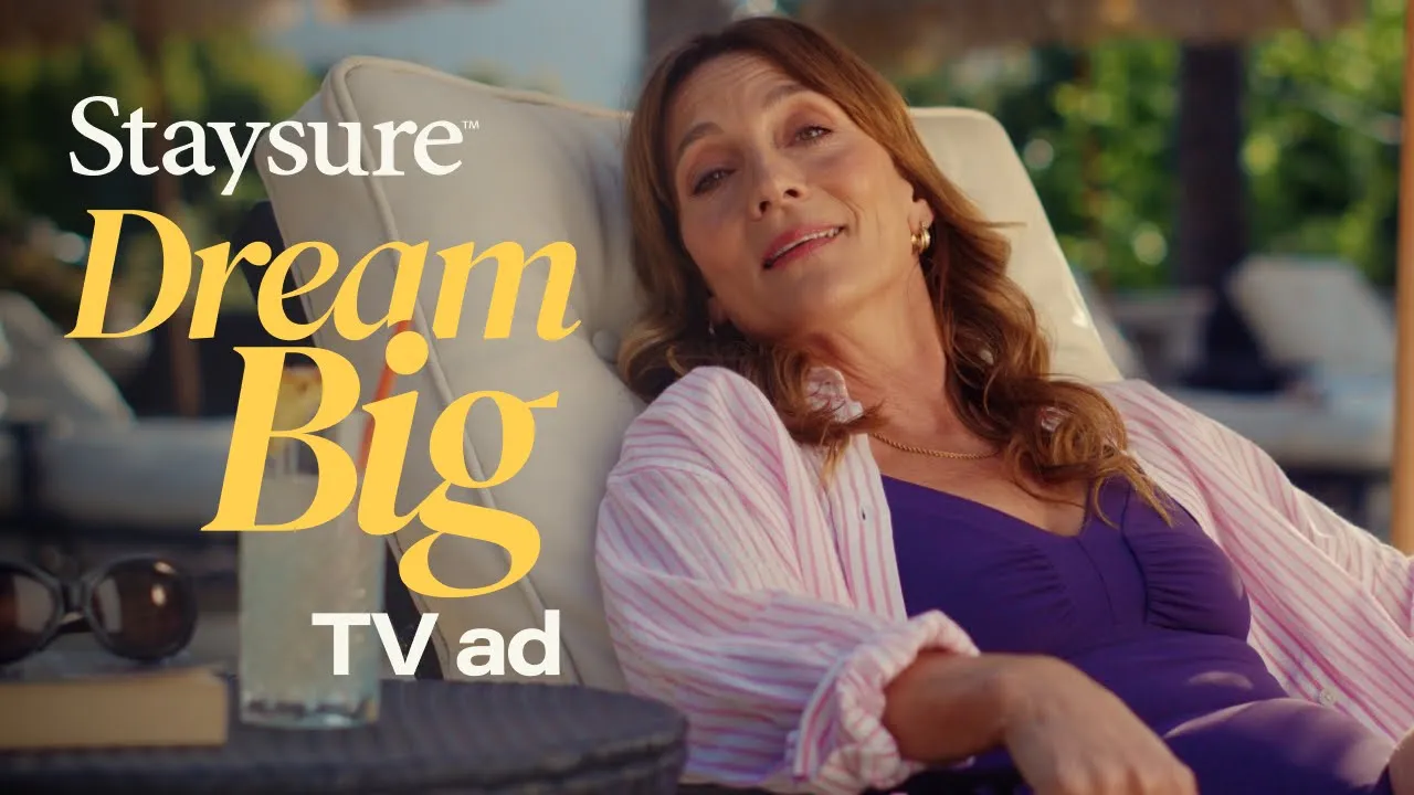

Dream Big, Staysure
Overview
Dream Big was Staysure’s brand refresh, created to feel more modern, more authentic, and more empowering for our customers. The project originated with a new TV commercial led by an external Creative Director. My role was to lead the brand refresh workstream and translate the TV idea into a practical, scalable brand system across digital and campaign touchpoints alongside the Head of Content.
I led and delivered this work end-to-end during a period of hiring freeze, operating as a solo Head of Creative while partnering closely with marketing, product, compliance and external agencies.
While the brand had grown in recent years, visually and tonally, it was blending in with the rest of the industry, using tired cliches and stock imagery. The ask was to reinvent the brand with a strong message that empowered our customer base and reminded people that age is just a number.
Categories
Creative Direction
Brand Identity
AI
Client
Staysure
Date
2025

48 sheet OOH execution

Winter sale paid social treatments

Redesigned email template
Process
Photography & Visuals
Instead of pixel-perfect studio shots, we wanted photography that felt like it had been printed at Boots in the 90s – warm, imperfect, alive. Stylistically, we used a soft, nostalgic colour profile and applied a subtle film grain to give everything a timeless, tactile feel. Not artificial or overly retro – just a nod to the kind of holiday snaps you might may have in a photo album on the shelf.
Typography
I chose a dual-typeface system that balanced expressiveness with clarity.
DM Serif Italic gave us our big energy. Bold, playful, and intentionally oversized, it tucked behind and wrapped around images, creating momentum and visual flair.
Acumin Pro brought structure. Its flexibility meant we could use it everywhere from big headlines to legal copy – all while keeping everything crisp and legible.
AI in the Workflow
This was my first chance to fully integrate AI throughout a campaign. Carefully I used ChatGPT for competitor analysis and brand tone benchmarking (without ever sharing sensitive data). Midjourney became a powerful tool for testing visual directions early, helping me explore different photography treatments before shoot. Figma, coupled with spreadsheet-driven templates, allowed us to automate asset rollouts. One core design, 50+ variations done in minutes.
Bringing It to Life Across Channels
The campaign was designed to be big and bold at every touchpoint:
TV: Crafted to generate talkability and PR, the ad mirrored our audience’s lives – not a parody, but a celebration.
Social & Owned: We made it easy for our customers to see themselves in the work – and many did, emailing in and sharing online with heartfelt thanks.
DRTV, print, radio, DM: Each one delivered the same punch, underpinned by the same powerful visual and verbal identity.
Takeaways
The campaign connected. Social channels and inboxes lit up with genuine responses from customers who felt seen – and the data backed it up.
That kind of emotional connection is priceless and rare in financial services.
We trusted the audience to get it. And they did. We built a campaign that reflects the truth: our age doesn’t define our ambition – only our attitude does.
The numbers backed it up. Post-campaign tracking showed 86% positive sentiment and 39% ad recall among those who saw the campaign – well above typical benchmarks for brand work in financial services.
Dream Big is more than a campaign. It's a mindset shift – for the brand, and for our customers.
Dream Big, Staysure
Overview
Dream Big was Staysure’s brand refresh, created to feel more modern, more authentic, and more empowering for our customers. The project originated with a new TV commercial led by an external Creative Director. My role was to lead the brand refresh workstream and translate the TV idea into a practical, scalable brand system across digital and campaign touchpoints alongside the Head of Content.
I led and delivered this work end-to-end during a period of hiring freeze, operating as a solo Head of Creative while partnering closely with marketing, product, compliance and external agencies.
While the brand had grown in recent years, visually and tonally, it was blending in with the rest of the industry, using tired cliches and stock imagery. The ask was to reinvent the brand with a strong message that empowered our customer base and reminded people that age is just a number.
Categories
Creative Direction
Brand Identity
AI
Client
Staysure
Date
2025
48 sheet OOH execution
Winter sale paid social treatments
Redesigned email template
Process
Photography & Visuals
Instead of pixel-perfect studio shots, we wanted photography that felt like it had been printed at Boots in the 90s – warm, imperfect, alive. Stylistically, we used a soft, nostalgic colour profile and applied a subtle film grain to give everything a timeless, tactile feel. Not artificial or overly retro – just a nod to the kind of holiday snaps you might may have in a photo album on the shelf.
Typography
I chose a dual-typeface system that balanced expressiveness with clarity.
DM Serif Italic gave us our big energy. Bold, playful, and intentionally oversized, it tucked behind and wrapped around images, creating momentum and visual flair.
Acumin Pro brought structure. Its flexibility meant we could use it everywhere from big headlines to legal copy – all while keeping everything crisp and legible.
AI in the Workflow
This was my first chance to fully integrate AI throughout a campaign. Carefully I used ChatGPT for competitor analysis and brand tone benchmarking (without ever sharing sensitive data). Midjourney became a powerful tool for testing visual directions early, helping me explore different photography treatments before shoot. Figma, coupled with spreadsheet-driven templates, allowed us to automate asset rollouts. One core design, 50+ variations done in minutes.
Bringing It to Life Across Channels
The campaign was designed to be big and bold at every touchpoint:
TV: Crafted to generate talkability and PR, the ad mirrored our audience’s lives – not a parody, but a celebration.
Social & Owned: We made it easy for our customers to see themselves in the work – and many did, emailing in and sharing online with heartfelt thanks.
DRTV, print, radio, DM: Each one delivered the same punch, underpinned by the same powerful visual and verbal identity.
Takeaways
The campaign connected. Social channels and inboxes lit up with genuine responses from customers who felt seen – and the data backed it up.
That kind of emotional connection is priceless and rare in financial services.
We trusted the audience to get it. And they did. We built a campaign that reflects the truth: our age doesn’t define our ambition – only our attitude does.
The numbers backed it up. Post-campaign tracking showed 86% positive sentiment and 39% ad recall among those who saw the campaign – well above typical benchmarks for brand work in financial services.
Dream Big is more than a campaign. It's a mindset shift – for the brand, and for our customers.