Hastings Digital Journey
Overview
Hastings Direct already had a solid digital footprint when I joined – a high-performing quote journey, a top-rated smartphone app, and a digital-first mindset. But like any fast-paced environment, there were cracks to patch and opportunities to scale.
The quote journey for car insurance was relatively new, but we were still seeing drop-off points – especially around policy upgrades and the pricing step. Too many pages between quote and purchase. Too much legal clutter. Too many opportunities to bounce. Additionally, accessibility was an area of concern. While our scores were okay, we were keen to push further forward and achieve AAA WCAG scores where possible.
Categories
UX/UI
User Research
Design Systems
Client
Hastings
Date
2022
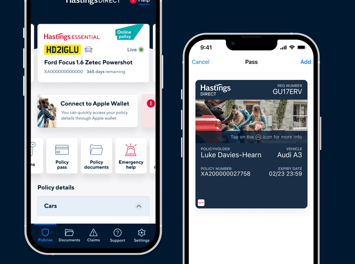
Digital wallet concepts for app and wallet

Some examples of the accessibility audit

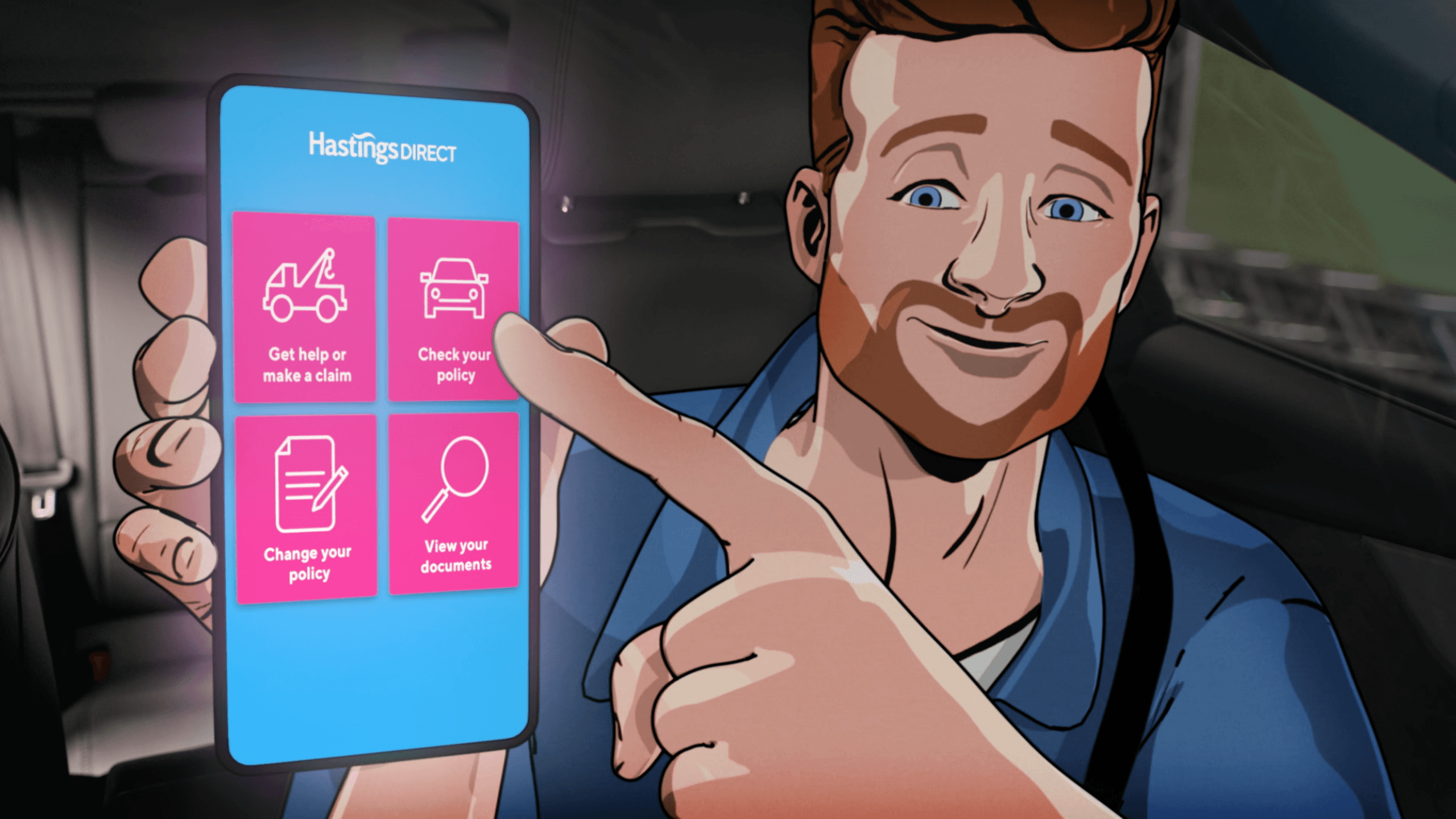
The Hastings app
Process
Tackling accessibility
This was a big ask. I audited 1,400 components in our Figma design system, working my way up from colour choices, to fully built components and interactions. While the majority of the components passed with flying (accessible) colours, 286 components failed and needed to be improved. and of the 1100+ components that passed, many of them were only at a AA level.
CRO and Quote Journey Refinements
Policy upgrades was an area where we were seeing drop-off. Our goal was to make policy upgrades feel less like tax forms and more like pizza toppings:
Clear options
Obvious pricing impact
Easy to tweak on mobile or desktop
Additionally, there was too much legal copy leading to too many screens. I worked closely with the Head of Content to streamline the flow - tackling duplication, reordering content for clarity, and drastically cutting unnecessary text.
Mobile App and Digital Wallet Exploration
On the app side, we explored how to introduce a digital wallet – something that would let customers keep their policy to hand and make it easier to claim on the go. I contributed to concepting and wireframing features that moved us closer to mobile-first servicing, building on the app’s momentum without bloating the experience.
Takeaways
The Accessibility audit was carried out to help frame how the journey would need to evolve in line with Consumer Duty, shaping a clear roadmap of improvements Hastings would deliver over the following 12 months.
Improvements in our quote journey
Drop-off in the quote journey fell, especially in the final stages between quote and purchase.
Policy upgrade selection became clearer and faster, especially on mobile.
The app maintained its position as the highest-rated car insurance app on both iOS and Android during my time there.
Customer adoption of the app increased, thanks in part to improved journeys and simplified pathways.
Though I wasn’t at Hastings long, it was a chance to sharpen my UX practice, improve a complex set of journeys, and collaborate on high-impact optimisation that made a real difference for the customer – and the business.
Hastings Digital Journey
Overview
Hastings Direct already had a solid digital footprint when I joined – a high-performing quote journey, a top-rated smartphone app, and a digital-first mindset. But like any fast-paced environment, there were cracks to patch and opportunities to scale.
The quote journey for car insurance was relatively new, but we were still seeing drop-off points – especially around policy upgrades and the pricing step. Too many pages between quote and purchase. Too much legal clutter. Too many opportunities to bounce. Additionally, accessibility was an area of concern. While our scores were okay, we were keen to push further forward and achieve AAA WCAG scores where possible.
Categories
UX/UI
User Research
Design Systems
Client
Hastings
Date
2022
Digital wallet concepts for app and wallet
Some examples of the accessibility audit
The Hastings app
Process
Tackling accessibility
This was a big ask. I audited 1,400 components in our Figma design system, working my way up from colour choices, to fully built components and interactions. While the majority of the components passed with flying (accessible) colours, 286 components failed and needed to be improved. and of the 1100+ components that passed, many of them were only at a AA level.
CRO and Quote Journey Refinements
Policy upgrades was an area where we were seeing drop-off. Our goal was to make policy upgrades feel less like tax forms and more like pizza toppings:
Clear options
Obvious pricing impact
Easy to tweak on mobile or desktop
Additionally, there was too much legal copy leading to too many screens. I worked closely with the Head of Content to streamline the flow - tackling duplication, reordering content for clarity, and drastically cutting unnecessary text.
Mobile App and Digital Wallet Exploration
On the app side, we explored how to introduce a digital wallet – something that would let customers keep their policy to hand and make it easier to claim on the go. I contributed to concepting and wireframing features that moved us closer to mobile-first servicing, building on the app’s momentum without bloating the experience.
Takeaways
The Accessibility audit was carried out to help frame how the journey would need to evolve in line with Consumer Duty, shaping a clear roadmap of improvements Hastings would deliver over the following 12 months.
Improvements in our quote journey
Drop-off in the quote journey fell, especially in the final stages between quote and purchase.
Policy upgrade selection became clearer and faster, especially on mobile.
The app maintained its position as the highest-rated car insurance app on both iOS and Android during my time there.
Customer adoption of the app increased, thanks in part to improved journeys and simplified pathways.
Though I wasn’t at Hastings long, it was a chance to sharpen my UX practice, improve a complex set of journeys, and collaborate on high-impact optimisation that made a real difference for the customer – and the business.


